Sandicliffe Re-design their Logo after 70 years
After 70 years as the East Midland's local motoring family, Sandicliffe have re-designed their logo whilst keeping their brand identity.
December 18, 2017
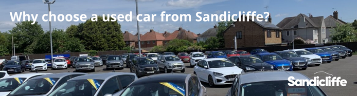
Sandicliffe are a widely renowned name and influential business within the East Midlands and automotive industry. Established since 1948 and awarded the Royal Warrant in 1974 from Her Majesty Queen Elizabeth II, for supply and maintenance of vehicles to the Royal family. Still a proud family owned organisation, Sandicliffe take pride in their firmly established brand identity and values that it stands for.
Since Richard Hobbs was appointed as MD at the beginning of 2017, he has put more emphasis on digital marketing, moving away from outsourcing and building on a 10-strong inhouse digital team able to be focussed purely on Sandicliffe.
Comments from Head of Digital, Joshua Hunt:
‘Since the beginning of the year the company has seen the start of some game changing projects that are under development from our digital team. As we expand our focus, it is important that not only is our online presence consistent, but that we retain the same consistent brand identity offline too.
![]()
Looking back over the years it is clear to see the logo’s slight evolution into a thicker font with closer letter spacing, then eventually the addition of the car shape at the top of the wording leading to the logo you see today.
![]()
During the process of reviewing and then creating the new logo designs, it became clear that a substantial change and going for a very different look would take us too far away from the established identity that had taken so long to build.
(Sandicliffe’s in-house digital team office)
![]()
![]()
The final version that we have created is a thinner variation of the original font with more refined rounder curves. This is not a dissimilar treatment that Google adopted when updating their logo. Each letter was precisely positioned with letter spacing and shape reductions that worked well when the logo was enlarged for use on billboards & big screens, but also geared to look good when reduced for business cards or social media.
To add the finishing touch, subtle changes were made to the colour from the original palette.

The digital team pictured above (Joshua Hunt, Head of Digital holding original logo on the left | Nichola Hudson, Web Designer holding the newly designed logo on the right)
Sandicliffe aim to roll out the new 2017 logo across all online and offline platforms over the upcoming weeks ready for the new year, on the build up to Sandicliffe’s 70th anniversary.
![]()

.png)